Porcelain stoneware learned to imitate stone long ago. But between "resembles marble" and "reproduces a specific stone with a specific cut" lies a distance few manufacturers travel. Coliseum's new range operates precisely in this way: each of the five collections is anchored to a particular stone, and that anchor is not marketing but the starting point for design.
Two perspectives on travertine
Coliseum devoted two collections to travertine—not duplication, but fundamentally different approaches to the same stone.
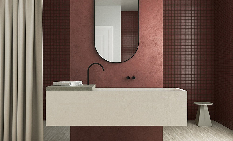
Roma takes travertine with a lengthwise cut. Extended layers, unbroken lines, a pronounced directional pattern—everything that made this stone synonymous with Roman architecture. The Roma palette is built from three shades: creamy White sets the softest tone, sandy Sand adds warmth, and Grey shifts travertine into a cool contemporary register. A stone with history, adapted to current interior demands.
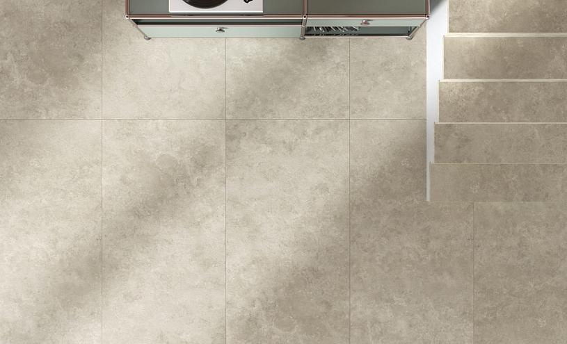
Tivoli reverses the angle—here Navona travertine is cut crosswise. Instead of linear stratification: smoky, cloud-like transitions, diffused tonal patches, texture without clear direction. The Tivoli collection is limited to two shades, White and Grey, and that suffices: the cloud graphics are so rich in themselves that additional colours would overwhelm perception. Choosing between Roma and Tivoli is choosing between rhythm and contemplation.
Marble without dictation
Four Seasons French marble is a stone with a forceful character: dark ground, expressive veining, dozens of chromatic layers within a single slab. Such stone subordinates an interior to itself. In the Vivaldi collection, Coliseum found a way to preserve that energy while softening the delivery. Sandblasting lightens the base and tempers contrasts, yet the graphics remain intricate and multilayered. Two shades in the Vivaldi collection offer different degrees of this transformation: White draws the marble toward a creamy luminosity, Cream retains more of the original saturation. For those who want marble with character—on their own terms.
The freedom of quartzite
Taj Mahal quartzite recognises no straight lines. Its beige veins wander, intertwine, dissolve—and in that freedom lies the stone's entire beauty. The Lirica collection conveys precisely this principle: the pattern on each tile is unique, the texture suffused with diffused light, and harsh contrasts are entirely absent. In the White shade, the Lirica graphics approach porcelain delicacy—veins are barely discernible against the cream ground. Grey reveals the interweaving lines more distinctly while preserving the softness for which the original stone is prized.
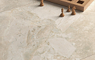
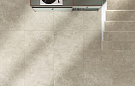
The quietude of limestone
Southern Italian limestone is the complete opposite of everything described above. Neither the expressiveness of Vivaldi marble, nor the free-flowing graphics of Lirica, nor the layered monumentality of Roma. The Salento collection is built on restraint: fine mineral inclusions, even tonal transitions, a surface that does not demand attention but shapes an environment. Three shades—White, Cream, and Grey—give the Salento collection the widest range in the line: from neutral backdrop to self-sufficient graphic accent. A stone for those who believe the best material is the one you do not notice until it is gone.
Five stones, twelve shades, a single 60×120 cm format. Coliseum's new range spans the territory from expression to minimalism—and at every point along that spectrum the porcelain stoneware remains faithful to the stone from which it began.